3.4 The Great Logo Switch

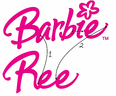
In this activity, I switched the Logos of Reebok and Barbie as seen above. I chose these two logos because they had the same amount of letters and they had a lot of the same letters in each logo and I chose them because they are both very different. The Barbie logo is sans-serifs and is a script font. The Reebok logo is also sans-serif but is more blocky and angular.
Here is my hand-drawn version of my Reebok and Barbie switched Logos. During this stage I experimented with how I was going to create my Logos, how I was going to make some of the curved letters like "A" straight for the Reebok re-design, vise-versa for the letters I didn't have from the Reebok Logo into the Barbie font.


This is my Reebok Logo redone to look like the Barbie Logo
To create the "R" in my logo, I started out by copying the vertical line of the "B" as well as the top loop and the top section of the second loop. I know that this logo has a scrip like font, so I did my best to create the rest of the "R" in a way that would make it look like it was written with a fountain pen. I kept the motions fluid and natural so it looks like it was always an "R" and not a "B" that was altered. I did this by using the pen tool. By utilizing the pen tool and bezir lines I found a way to not disturb the flow of the first letter.
For the "E", I made a copy of the "E" at the end of the original logo. Since the font is very script like, I decided to make the two "E"'s connect to each other. To make this look good I removed the 'dots' at the end of each of the "E"'s. For the second "E" I replaced the 'dot' with the 'tail' of the First "E"
To make the "REE" in my logo I wanted to make it look like cursive. To do this and make it look natural I made the end of the "R" feed into the "E" and the first "E" to feed into the second one. The result made it look like cursive without being forced and while flowing and not breaking the work up.
For the "B" I just copied the lowercase one that was already in "BARBIE"
To make the "O" I made a copy of the "A" with the pen tool and then cut off the 'line' of the "A" using shape-builder to make an "O".
For the "K" I started out by copying the 'line' of the "B". I looked at how the curve of the "B" looked like and I decided to take a similar approach to the little lines of the "K". instead of making them straight and sharp I made them more script like by making them curved and making them thicker around the ends and thinner around the middle and curves.
In the finished product, I put my "REE" letters to start off and made sure that the letter that was following it, "B", was placed very close to the end of the last "E". I put them as close as I could without them touching to mimic the original Logo. This was something I did for the rest of the letters as well. For the final two letters, "O" and "K", I placed them, so that they too, were very close to their surrounding letters, to the point that they were almost touching. I kept adjusting the final placement and made sure to make each letter slightly higher than the one before it, just like the original. To finish off I used the eyedropper tool to pick the right colour for the logo and I was finished.


This is my Barbie Logo redone to look like the Reebok Logo
To make the "B", I decided to use the vertical line of the "R" as well as the first loop of the "R", to make the bottom loop of the "B" I took inspiration from the lowercase "B" already in the logo and what the "R" would look like flipped. I created the bottom loop of the "B" using the rectangle tool and pathfinder, making sure to keep a gap in the middle of the letter to keep with the theme of the original logo.
For the "A", I took inspiration for how the "B" would looked reflected and hoe the "E" looks. I copied the curve and the little slant of the "B", the only adjustment I made to the letter was for the vertical line, I drew it the same width of the "B"'s vertical, but I extended it a little at the bottom to make it look more like an "A".
To make the "R" I made a vertical line the same widths as the other letters. I wanted to make the top part of the "R" curved and slanted/similar to how the "B" is. when I had a top section that was the right, width, length, and 'slant' I used the envelope distort tool to curve it and I put the two shapes together to make an "R".
For the "B" I just copied the one already in the logo.
The "I" I made, I decided to make it the same size as the vertical line of the "B". To make it look like an "I", I made the base section the same hight as the rest of the lowercase letters and made the tittle the size of the remaining length of the "B". Making sure to leave a gap for differentiation
For the "E" I just copied the one already in the logo.
When I had all of my letters finished I alined them so that they were all sitting on the same line. I played around with the distance between letters making each letter the same distance away from each other. I used the eyedropper tool to pick the colour that I wanted and I was finished.
Tools and Keyboard Shortcuts I used:
-
Pen Tool (P)
-
Rectangle Tool (M)
-
Ellipse Tool (L)
-
Shape builder Tool (Shift+M)
-
Pathfinder
-
Eyedropper (I)
-
Envelope Distort>Make with Warp